Death to Ugly Android Screenshots
Clean Status Bar is an app I created in September 2014 to try and make taking nice screenshots for the Google Play Store easy and fast. Ugly screenshots are a distraction from the app you’re trying to show off, and have become somewhat of a pet peeve of mine. When I’m looking at an app on the Play Store and wondering whether it’s worth downloading or not, the first thing I look at is the screenshots. Why wouldn’t you show your app off at its best?
The idea came about after I had to produce a large number of screenshots for a client project: 8 screenshots of the app, showing 3 different currencies (GBP, EUR and USD), timed by 3 different screen sizes (phone, 7” and 10” tablets). It took forever - I painstakingly photoshopped the status bar of each screenshot to be clean and without the distractions of low/charging battery, notifications or poor WiFi/data connection. There has to be a better way!
How it works and how it grew
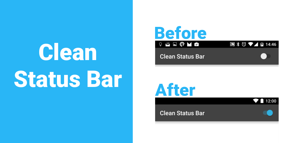
Hiding the real status bar is not possible, so the app just draws a black rectangle over it - the time and icons shown in the top, right corner can be configured by the user.
The app as it is today
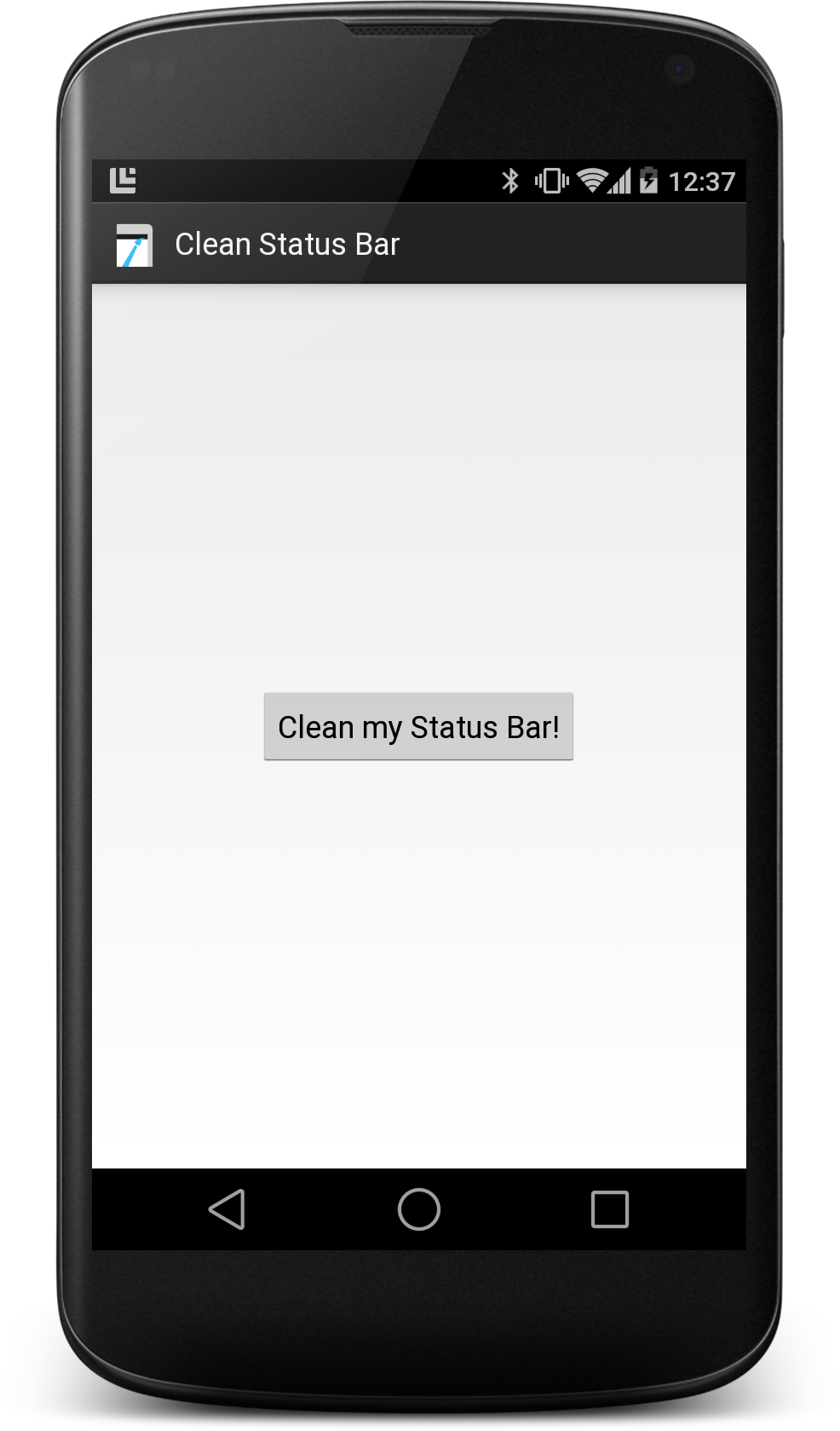
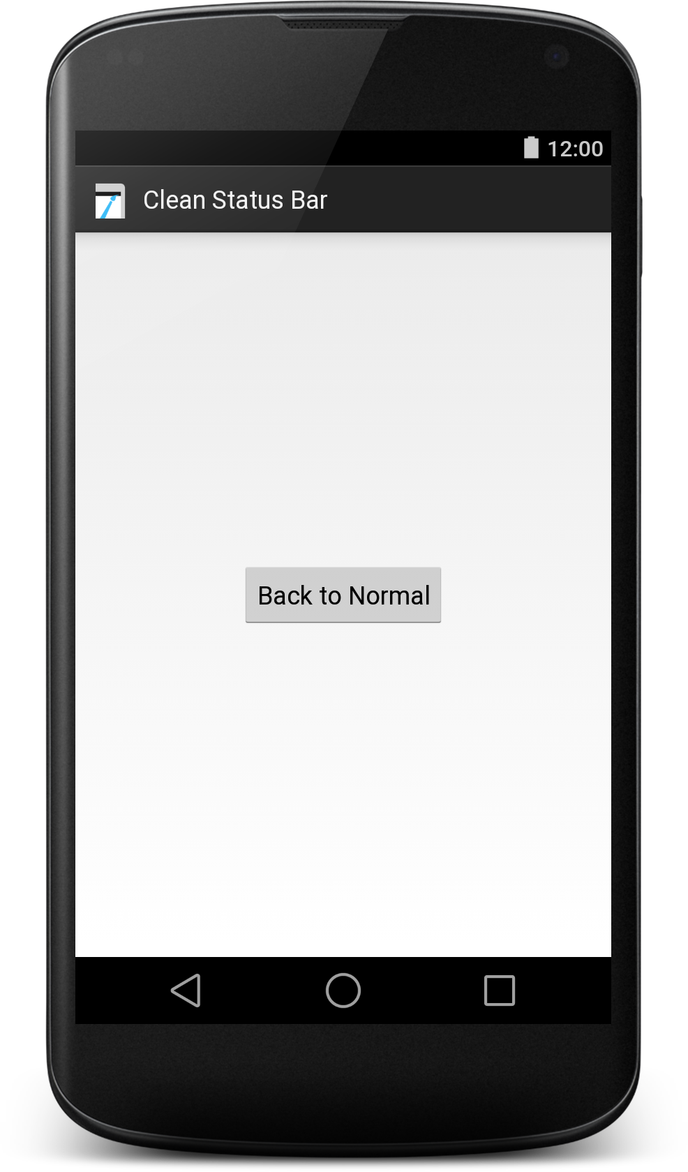
Initially, the app just had a single button, letting the user toggle the black background with clock at 12:00 and battery 100% charged on and off - when pressed, the button started a Service which created the fake status bar. Drawing over other apps is done with a permission called SYSTEM_ALERT_WINDOW, which I first encountered using Link Bubble.
To achieve an exact replica of what my actual status bar looked like, I opened Android Open Source Project (AOSP) and copied the BatteryMeterView, deleting anything that was not do with drawing the battery showing 100% charge. Similarly, I ensured the clock display matched AOSPs. Initially I was aiming to get the the status bar pixel perfect for my own phone (a Nexus 4 running KitKat). Generally I was aiming to support Google’s Nexus devices - that’s what I had and knew, and really that was all that was interesting for me. Other manufacturers mess around with the appearance of many things, the status bar being one of them, and trying to get all of those accurate was not a challenge I was interested in taking on.
| v1 normal status bar | v1 cleaned status bar |
|---|---|
 |
 |
Incidentally, there don’t seem to be any guidelines around what the time should be on Android screenshots, unlike on iOS where the convention is 9:41. Personally I still like 12:00, but for some brands/apps it can makes sense to be something else.
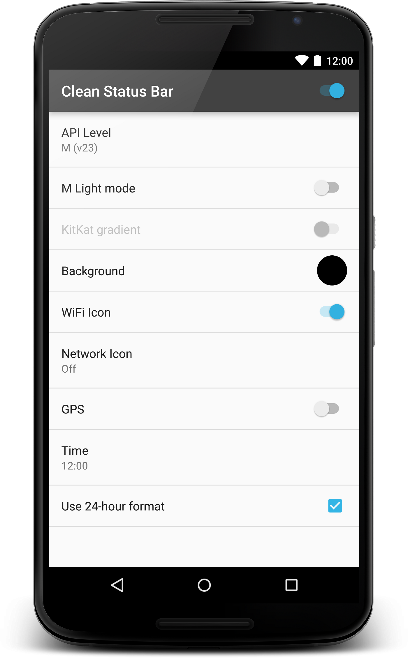
Slowly, over time, other Android versions and capabilities were added - from full battery and 12:00 only came the ability to manually change the time and toggle different icons for the top right of the status bar - e.g. WiFi, network and GPS. Ensuring that the spacing, fonts, icons and assets had the correct colour and size for each platform took a fair amount of time to get right and test - Jelly Bean has blue icons, KitKat can have a coloured gradient background, Lollipop introduced new icons and the ability to have a solid coloured background and more recently, Marshmallow brought the light status bar.
I had a number of feature requests to let people take screenshots with a transparent status bar, e.g. as you would see on the lock screen. Unfortunately because of how it works, by drawing over the existing status bar, transparency is not possible.
Reception, feedback and the Google Play Store
I’m very proud of the app - it was featured in Android Weekly twice and some of the 5 star reviews on the Play Store have been lovely (saving people’s time is awesome!). It was also used in the demo videos in the 2014 Droidcon NYC keynote.
However: the app continually receives 1 star reviews on the Play Store.
These are not reviews by those actually using it as intended - the feedback I’ve had from developers has been phenomenally good. But for some reason, the app gets downloaded by loads of non-developers, who seem to be generally very confused about what it is and does. Overwhelmingly, those reviews state that “the time does not update”.
I have no idea why it’s so well downloaded by non-developers - perhaps there is a real need for a customisable status bar? Perhaps I should have given it a different name, to focus less on the status bar but more on its usage for taking screenshots? I did try a number of things, but nothing seemed to make much difference.
Putting it on the Play Store in the first place was probably a mistake - it could have remained solely an APK for download from GitHub. My curiosity of seeing how many downloads it would get is partially to blame (currently 70k), and I thought that the convenience of the store would help developers find it.
Thinking about this more, a possible solution to this could be to have a new category of developer focused apps on the Play Store, which are only visible if you have ‘Developer Tools’ enabled on your phone.
Things I learnt about open source
This was my first open source repository that has had much use by people other than me - and I learned a lot from it. It had a number of contributions:
- Issues filed and fixed that I hadn’t noticed
- Features suggestions with awesome ideas (such as using Intent to configure it, for use in a CI environment for automated testing or to add the APK to the ‘releases’ part of the repo)
- Translations in to other languages - French, Italian, German, Slovak and US English
I had a hilarious contribution from an American adding US localisation, who raised a pull request (PR) detailing the discovery of America and how the lack of the “u” character in the spelling of some words came to be - which still remains one of my favourite PRs of all time (also because the branch name was called ‘USA_USA_USA’). Someone else opened a PR renaming the project to ‘Clean System Bars’ and including the navigation bar - I felt terrible declining something someone had clearly put some time into, but I wanted the app to remain focused on only the status bar.
Feedback from users
One user was using it for a use case I’d never have thought of - he wasn’t allowed to use his work’s WiFi, but he was doing it anyway and used the app to hide the fact he was connected to it.
Another was a particularly nice email from a Russian speaker who had noticed all the 1 star reviews in Russian on the Play Store - they included a couple of Russian sentences which I could add to the description, to try and explain better the app’s purpose to those who don’t speak English.
What’s next
Slowly but surely, Clean Status Bar is becoming obsolete.
There are two reasons for this: firstly, Android Marshmallow provides official support for what it does in the ‘demo mode’ feature. Secondly, Marshmallow introduced a change in how the permission to draw over other apps works: you now have to explicitly allow the app to draw over other apps in Settings. Whilst this in itself isn’t a huge problem for an app that targets developers, it’s an extra hurdle - and coupled with the ability to use demo mode instead, I don’t see a good reason to target SDK 23 or higher.
I’m not too sad about it though - it was a fun project but it’s better that Android itself has added a way to keep those screenshots clean.
Special thanks to everyone who’s contributed to the project, and to Robbie Vanbrabant for reading a draft of this post.
If you enjoyed reading this post, you can find me on twitter @emmaguy